We chose to make a horror film for our Grindleford shoot as it has simple and instantly recognisable codes and conventions that we could adhere to whilst coming up with inventive ways to capture the key sequences. After a basic script was produced we began to plan the types of shot we wanted, factoring in the required elements in ways that would complement the build up of suspense. We were in agreement that a static camera would conflict with the wild terrain of our woodland setting and the way we wanted to capture the more frenetic action scenes, and so we filmed almost entirely on a glide-cam mounted DSLR, with a few shots obtained with a shoulder rig. As primary cameraman Tom did a great job with the glide-cam, managing to fluidly follow fast moving action on uneven ground without creating undesirable jerkiness in the shot. Following a Recce we had devised a shot list and some storyboards that were fairly adaptable to the scenery (a lot of hiding behind trees), and also several key shots under the bridge. We did however improvise several shots based on other things we came across. The rope-swing for instance initially served as a source of procrastination for half an hour before we realised it would be a good way to demonstrate the enjoyable part of the couple’s trip. A few shots from the script ended up being altered due to practicality on the day of filming. Whilst they were supposed to take pictures near the bridge/stream to foreshadow the location of a later scene, we had intended for the killer to be introduced much earlier as a P.O.V. shot through the camera lens in the background. This was dropped as well as the original bridge climax in which the killer drowns the man in the stream, which we had planned to get point of view GoPro shots from underwater. These were ultimately dropped as no one particularly fancied getting cold and wet in the stream and instead we opted for a disorientated P.O.V as the man crawls out of a tunnel after being hit on the head. It’s a very well executed shot and gives the impression of being on the edge of consciousness and the transition for the dark tunnel to the daylight is effective. The downside of dropping the other shot was that the killer is not introduced for quite sometime so there is no cause for suspense.
When the killer is introduced however it’s suitably dark and unsettling. He can be seen by the girl dragging a tarpaulin in an over the shoulder shot from afar, which is revealed to contain a human corpse. We filmed several angles of me kicking the body into a ditch (hats off to Luke for allowing a good five or six takes of that), which we’d padded with leaves as best we could to ease his plight. Then comes a long take in which we incorporated some classic horror tropes. The camera follows the girl as she peers round from the tree, the killer is stood watching her and she quickly ducks back out of sight with the camera staying on her, when she looks back the killer has vanished and a split second later her boyfriend surprises her our of nowhere. The result is quite sinister, all the more for being in a single take without a cut. For the interior light change we opted for a day to night transition in a tent with a camping light being switched off. Whilst we set up the tent in Grindleford this shot was picked up several days later as we had hoped to utilize the performance studio to light this scene. It was unavailable in the limited time we had left however so it was shot in Natalie’s back garden using a Kino Flo Diva 200 and some Dedos.
When the man awakes his girlfriend is missing. I particularly like the 360-degree pan round as he emerges from the tent panicked. After running around he finds her tied to a tree with a burlap sack on here head. We chose this specific tree as it was raised on a rocky mound which looked more dramatic on screen, but was irritatingly steep to climb up on without slipping. Whilst the man hides behind the tree the killer returns from the distance in a similar fashion to the way he was introduced. The take used was one of two instances when my hood fell off and I hurriedly pull it back on, which detracts from the menacing anonymity of the killer so I’m not sure why it was used when we reshot it to avoid that. The low-angle tracking shot with the bat coming in and out of focus aides in ramping up the urgency of the situation before the chase ensues. This is particularly where Tom’s steady hands deserve tribute as he manages to stay on the action despite a chase running full speed downhill. The sliding down the rock was my personal favourite thing to shoot, owing to the careful co-ordination required to pull the stunt off, and one of the more cinematic aspects of our piece. This was another improvisation on the day and really helps to inject some adrenaline into the piece. We filmed from a low angle at the bottom of the rock, as well as a tracking reverse shot. We also got a point of view with the GoPro as Joe slides down at looks back at his near miss, and another with the camera attached to the bat. These were unusable however as the rest of the crew are visible in the shots which we didn’t realise at the time owing to the lack of playback on the camera. The aforementioned tunnel scene follows, with a wide shot of the man hiding in the tunnel with the killers legs and weapon visible above him not making it into the final cut. The concluding shots show another distant P.O.V as the man sees his girlfriend killed followed by a close up of his reaction.
I think we filmed a good mix of shots, with close-ups conveying more intimate and emotive moments, tracking shots of the more intense action and the use of low angles to obscure the killer’s identity for the audience. Some of the resulting footage was over exposed and a lot brighter than it appeared on the camera, although we did adjust the ISO accordingly depending on when the sun was out of the clouds. The weather conditions made for a great day of shooting, however there was some rain on the second day but luckily we had the tarp to shelter under. Ideally I would have liked for the initial shots of them enjoying the forest to be captured while the sun was shining and to have taken advantage of the overcast moments once the killer is introduced but we couldn’t afford to be too picky with our schedule. A similar effect was hopefully achieved with the colour, starting out bright and vivid only to become more desaturated as things took a turn for the worse. Green would obviously be one of the more significant hues owing to the location and I envisaged using it to reflect the female characters unease and reluctance for the trip, although I don’t think this came across so well in the finished picture with only limited time for colour correction.
I was chiefly in charge of the production design and props and am pleased with what I managed to produce, giving the killer a creepy but realistic appearance without going to over the top and giving him his own signature weapon. The tarp, rope and camping gear was all put to good use as well, drawing some bewildered and amused stares from passers by once they were brought into action. The burlap sack on Natalie’s head was a scarecrow mask I’d made for Halloween, and we tried not to explicitly show this as it is too similar to the one worn in The Dark Knight Trilogy. The fake blood on Joe’s head looks suitably dark on film, which I’m pleased with. We worked well as a unit, taking on board each others suggestions and experimenting with different ideas to get the best result. The decision not to include sound made the shooting process infinitely easier but as horror films scare audiences primarily through a build up of sonic atmosphere and suspense followed by a jump moment this obviously detracts from the overall impact of the finished piece. The use of natural lighting also made for a much more efficient shoot as every shot didn’t require a ten minute set up. The fact that we didn’t end up using actors had its pros and cons. The performances suffer somewhat although I think Joe and Natalie did a good job given their inexperience, but the benefit was getting to incorporate the rock slide stunts and corpse kicking which proper actors may have been unwilling to do. I feel these shots are more gratifying to the genre we were emulating and provided the most enjoyable moments whilst on location. Overall it was a fairly efficient shoot with most set ups only requiring two takes to get right.The strongest elements of the piece for me are the sensory disorientation point of view crawling out of the tunnel along with the smooth glide-cam tracks. I believe we used a good range of depth in the framing of our shots from close ups to long distance that manages to convey the threat of the situation to the characters. The woods offered a great array of scenery that we were able to exploit in a multitude of ways to achieve a cinematic aesthetic, and I believe we only really scratched the surface of the potential it presented. I would quite like to return there to shoot a similar film on a larger scale as horror is such a simple genre to work within and one can be infinitely creative when devising ways to dispatch victims for the camera in an environment like that. Aside from some overexposure I think the majority of camera work is strong and the main pitfalls are the lack of sound, narrative pacing and rushed edit. I was glad of the opportunity to shoot in such a scenic location with an amiable crew and it was a valuable learning curve. We quickly learned to adapt to the weather patterns and make the most the light when it was available. I also now appreciate how powerful the cinematic device of a subjective shot can be as well as the intricacies and co-ordination required when capturing a long take that features several cues for action.
Friday, 3 May 2013
Evaluation
Saturday, 27 April 2013
Colouring book
Hero (2002) makes astonishing use of its vivid colour palette, with costumes and locations changing in hue with each altered telling of Jet Li's Nameless Hero's victor.
The Red recount is pure fantasy, whilst the calming blue represents the supposed reality whilst the actual reality is denoted in the white hue scenes, with the green hue being a contemplative and epiphanic version of the story. These colours also have elemental qualities that parallel the variations on choreography in each fight scene.
http://attrition.org/movies/hero.html
The uprise of the ORANGE AND TEAL TREND
As the internet has been quick to Point out, (on more than one occasion), there has been a rapid increase in the lazy use of a contrasting colour system in Hollywood blockbusters, as evidenced by these posters to name but a few...

The trend doesn't stop with the posters however. The digital age ushered in a whole new film making process to replace the previous mechanised practices that were much more time consuming and delicate to master. Post production colour correction is now an easily available to anyone where-as before the colours on screen would have to be pre-determined by lens filters and art direction. Contrast was key for creating mood in black and white films but more easily achieved when there are only two tones to work with. With the advent of colour however creating contrast could be a little more difficult, and it seems that in recent years colourists have looked at opposing hues on a colour wheel and decided that as orange is the closest match to human skin colour than blue is the obvious go to create contrast.

The associated connotations with each colour are also at odds, blue being cool and calming whilst orange is bright and energetic, creating further connoted clashes on screen. The result of this tends to be an overly ambient blue location or background set against characters that look like they've had a tanning accident.

Shia Labouf laments his rejection from Jersey Shore to the Transformers

Although no colour correction would be required, thankfully people from Jersey are seldom cast in films.
The recent trailer for The Hunger Games: Catching Fire (2013) perfectly demonstrates the use of this palette, with the dystopian slums shrouded in cold desaturated blues and greys whilst the elite enjoy their luxuries surrounded by a warm orange hue that gives Donald Sutherland and Philip Seymour-Hoffman an un-natural glow almost akin to the titular flames on display.
Friday, 26 April 2013
Recce +production Pictures


trying to act inconspicuous to the passers by.


'the danger slide'


The tunnel of love


The reverse angle of danger slide

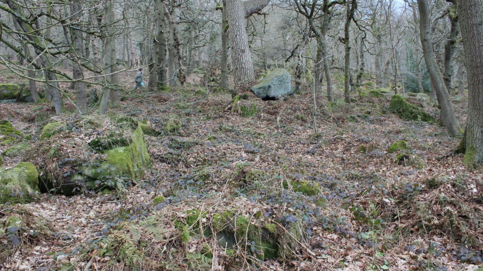
the ominous no-pride rock


no-pride rock


'the danger slide' front on
Subscribe to:
Posts (Atom)